{ "title": "Smartym Pro integrated approach to solving design problems" }
Business challenge
Smartym Pro is an International software development company. In an approach to keep up with the market challenges, Smartym Pro made a decision to start providing outrageous design services in addition to web and mobile application development. The services should imply providing all the necessary design data and components to the clients. Final goal - receiving design orders.
Design challenge
A competent Digital Product design team was the Smartym’s search target. It should cover a full process circle starting from Product Strategy and ending with digital Styleguide and UI design development.
Stages of development
Discovery & Strategy
- Acceleration & Collaboration Workshops
- Personas
- Interview
- Competitor Analysis
- Journey Mapping
- Web-analytics Analysis
Solution Wireframing & Visual Exploration
- Information Architecture
- Proof of Concept
- Stylistic Solution
UI Design
- UI & Visual Design
- Visual Prototype
User Validation
- User Testing
- UI & Visual Design Update
Guides & Measurement Plan
- UI Kit
- Digital Styleguide
- Marketing Materials Guide
- Web-Analytics Measurement Plan
Design Review
- Development Support
- Design Review
- Perfomance Validation
Discovery & Strategy
In order to boost the team processes we conducted web-analysis and desk research, continuing with interactive collaboration workshops. Thus, we succeeded in forming a common vision on Competitors Context, Service Personas, Current and Target Customer Journey Maps, Design Principles as well as Product phases (both short and long term) to have a clear view of opportunities and complete a full-fledged plan.
Proto-personas
Irreplaceable tool that helped set the structure and Smartym Pro customers’ priorities, define their perspectives and opportunities. This information would be validated later within a qualitative user research.

Customer Journey Map
In addition to Proto-Personas, Current and Target Journey Maps enable the team to get a complete service picture, clarify the opportunities and get a “sneak peek” of how the current service structure will be transformed under the influence of the digital product.

Competitor analysis & Web-analytics
In this case competitor analysis represents SWOT analysis of main competitors’ design service structure. We utilized both offensive and defensive strategies in order to identify the suitable structure model for Smartym Pro also based on web-analytics results per each competitor. The concluding stage - combine in one framework all the relevant outcomes received at the end of the competitor analysis. Finally, we managed to specify our own effective strategy as well as implementation, monitoring and adjustment plans.

Information Architecture
This is one of the most important functional parts of a product - a hierarchical structure of the future app’s screens with description. Information architecture’s goal is to organize content in a way that is easy for future users to adapt to the functionality of the product and so that they could effortlessly navigate.


UI & Visual Design
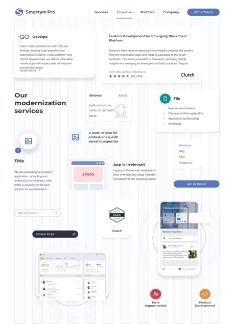
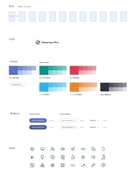
The key requirement was to create a minimalist style with blue color shades predominance. We took flat illustrations as a basis to quickly perceive the goals. During the SWOT analysis stage it was found out that Smartym Pro needs to acquire video content in order to attract more users’ interest.


Great on any screen under any circumstances
Any web product should work equally perfect on any device. We managed to achieve this with a fast and convenient navigation system and eye-pleasing information layout.
Style Guide & UI Library
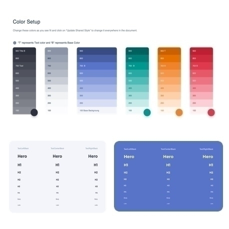
For better project maintainability and support processes a large number of UI components and rules were created. We developed a full-fledged guide with all the parameters of components as well as strict rules and instructions on how to use them. It will help to establish favorable working conditions both for design and development teams.
Time to start a new project? Or just want to say "hi"?
- Smartym ProPolandPoland, Warsaw, Aleja Armii Ludowej, nr 6
- UK7 Whitechapel Road, E1 Studios Office 406 London E1 1DU
- GermanyGermany, Frankfurt, Weissen Turm 33
